In 2020, Billy Jealousy expanded their award winning men’s grooming line to include a collection of CBD products for beard, shave, and hair. I developed the packaging to be consistent with existing product packaging while still imparting a high-quality, science-driven, minimal look and feel.
I also developed all product launch materials to give customers unfamiliar with CBD all the information needed to trust the product with a design that entices and excites. I worked closely with the photographer to style and direct the product photoshoot to create a clean, minimal feel that I later enhanced with typography reminiscent of 1970s counter culture.
Billy Jealousy is an award-winning men’s grooming company known for their beard care products. I designed the packaging and product launch collateral for their new line of 6 beard balms. These products were launched at all Ulta Beauty stores and online at ulta.com and Amazon. I designed the packaging to be consistent with existing Billy Jealousy beard care products, while still standing out in the product line and more importantly, on the store shelves.
Each beard balm has the same base formula with a unique scent, so I modified the classic Billy Jealousy bearded man logo to represent the personality of each scent option. The use of the large, foiled bearded man logo is intended to help draw the eye to the product in stores and make it very clear to the female shopper in Ulta what the product is.
I was solely responsible for bringing the packaging for these products from concept through pre-press, and I was additionally responsible for creating all product launch graphics, including web banners, email touchpoints, social media ads, and in-store signage.
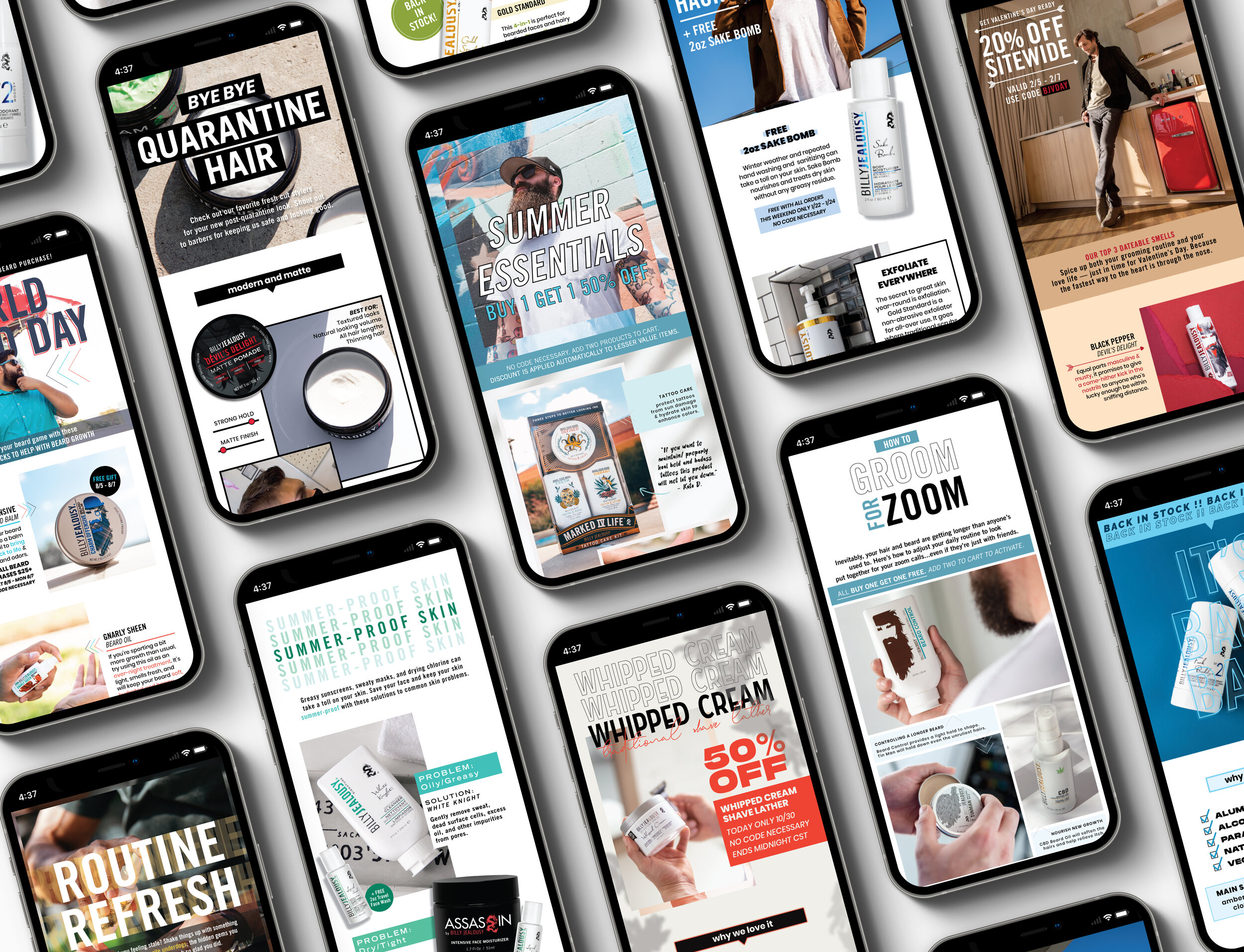
Billy Jealousy is an award-winning men’s grooming company with a large portion of their sales generated from online purchases. To enhance the online customer experience and drive more online revenue, I developed a weekly email newsletter. The weekly emails offered subscribers exclusive promotions and useful tips, tricks, and trends to enhance their grooming routine. I designed every email to be entirely unique to represent the topic and keep subscribers engaged and interested, while maintaining a consistent brand voice and brand image through type, imagery, and copy. These weekly emails led to a 136% increase in online revenue attributed to email marketing within 6 months of implementation.
This brand identity redesign was created under the direction of award winning master graphic designer Steff Geissbuhler at the Savannah College of Art and Design and used solely as a student project. The Frayed Knot yarn parlor, located in the heart of historic Savannah, GA, is an elegant and sophisticated yarn and craft store that offers specialty products and services to the many creatives in the area. Nearby SCAD offers degree programs in Fashion and Fibers, thus the area is buzzing with artists with a keen understanding of The Frayed Knot's yarn products and production tools. The goal of this project was to redesign the business's logo and identity to better represent the level of sophistication and style of the store and its clients.
To do this, I created a new, organic 'yarn ball' form. The new form emphasizes the coexistence of simplicity and complexity in fiber art and fashion. The abstract nature of the form allows for versatility and flexibility in brand collateral. In addition to this, I created a custom typeface and logotype to pair with the form which could easily be implemented on POS collateral, such as the free bobbins at the checkout counter.
The history of music recording techniques is a subject that weaves in and out of pop culture, science, and technology throughout its existence. This graphic timeline documents the“evolution” of these techniques and represents the relative popularity and lifespan of each. The main objective in creating this graphic was to express the spirit of the information at hand in an unexpected and beautiful way, straying from the typical timeline structure.
The graphic was intended to display multiple variables of information, but still read as a clean design that could believably be used as wall art. To incorporate a wealth of information, the main sound byte graphic represents chronological technologies and their relative lifespan and popularity. Custom vector icons were also created to represent each recording or listening device. yet this identifying information is on a removable transparency above the timeline graphic, to allow the poster to be displayed and appreciated as the user prefers.
This business started as a test of my entrepreneurship skills. I created the business idea: a 24-hour full service shared studio for creative professionals, then carefully researched and calculated the processes, costs, and logistics of hypothetically starting this business in the creative hub of Austin, TX. After proposing the idea to a panel of investors for feedback, I began building the business's brand identity and collateral.
The challenge in creating this brand identity manifested in maintaining a balance between the business's strong artistic voice and its role as a community for a variety of artistic voices. The resulting brand identity is intended to be neutral enough to allow the collection of artists and designers that make up the potential clientele to shine, while maintaining a clear identity that is obviously modern in design, thus the outcome is experimental, trendy, and recognizable. To support the brand identity, I designed print collateral, packaging samples, print advertisements, outdoor advertisements, and a website.
This project includes print materials created for an elegantly rustic, vintage inspired wedding, as well as a photo book of engagement photos given to the couple following the event. I styled, shot, and edited photos to announce the engagement of Elise and Ryan Hamilton of Dallas, TX. I then created wedding invitations and response cards for the couple's 100+ guests, and designed and produced print collateral for the event, including programs, signage, seating arrangement information, bar menus, and graphics for decoration. Following the event, I designed and created a lookbook of the photos taken for the couple's engagement as a personal gift. The photo book created for the couple continues the rustic yet romantic theme of the wedding through the use of hand-drawn illustrations and photos of the couple that capture this essence.
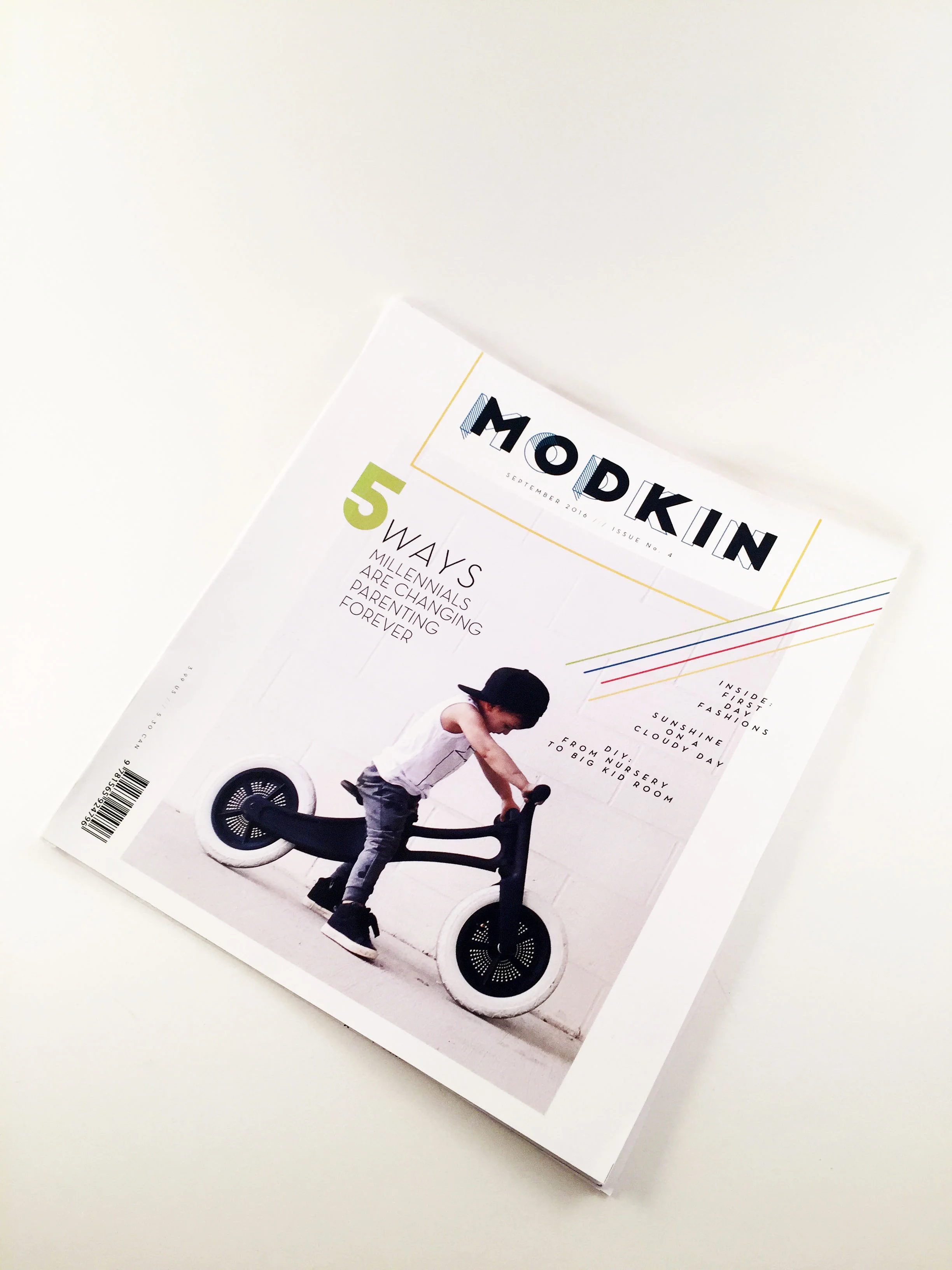
Modkin magazine was designed to represent the lifestyle of the ‘modern munchkin’, providing the moms of these munchkins with engaging articles about activities, toys and lessons for raising a child in modern culture, baby and toddler fashion, and issues affecting today's young mothers. This magazine represents a unique parenting perspective, and capturing this style was the main objective throughout the design of the magazine’s branding, content, and layout.
In addition to the print magazine, an app was created to extend the reader’s experience and meet the expectations of the relatively young customer base. The app allows busy moms to easily browse, search, save and organize articles and featured products.
*Student project: NOT created by, for, or in association with Farberware Cookware. Logo/Trademark is property of Farberware Cookware.
Farberware is a trusted brand of durable cookware with an already strong customer base. The goal of this campaign was to spread the brand’s reach to the often less targeted market of men who cook. The clear challenge lay in creating this series of ads to attract an audience not usually targeted by this brand, and doing so with an unexpected voice that obviously avoids cliches surrounding men who cook. A custom hand drawn typeface was created to mirror this unique yet relatable attitude in the advertisements’ art direction.
This set of twenty-one unique icons were created to commemorate The Beatles and twenty of their greatest hits. Each icon was inspired by a song, drawn first by hand, then recreated in a vector format.
To capture the essence of The Beatles and the context of the band’s music, the icons were drawn in a 1960’s-inspired pop art style. The color palette additionally references this decade’s art and culture, mixing primary colors with warm neutrals. The twenty icons were then arranged chronologically according to the release date of the songs they represent. The resulting graphic is intended to invite the viewer to interact with the piece, testing the knowledge of the band’s vast fanbase.